


Quick 101 refresher
Take a page from advertising expert David Ogilvy to create an ad layout formula to maximize the effectiveness of your ads and flyers.
According to research, readers view – in order – the following elements.
- Visual
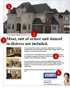
- Caption
- Headline
- Copy
- Contact information

Of course, this isn’t the only way to layout an ad. But, if you’re struggling, this might offer a template from which to work.
19 tips to keep in mind
Ad Layout
- People look one quarter of the way down first. This is the best spot for any attention grabbing content.
- Place the picture(s) in the top quarter or half of the page, above the headline.
- If you need a multi-page “brochure” as used in luxury listings, include the strongest benefit on the cover, not just your logo and a non-property picture.
- Maintain layout consistency. Don’t continually change the layout of your ads.
- Pictures can increase the response of an ad by ~ 50%.
- The use of graphs, charts and diagrams in your ads will assist in selling if they demonstrate real benefits.
- For a single column of text, justify text to the left, so the right edges are jagged.
- If you must justify text (as in magazines) it’s best used for narrow columns of text.
Type Face
- A Serif typeface (i.e. Times New Roman) can be read more easily.
- A Sans Serif typeface (I.e. Arial) lends itself to a strong clean cut appearance, suitable for short amounts of content (plus it probably matches your web site).
- For the average target a 10 point type is about right for the main text in an advertisement.
- If you target an older target base, consider using 12 point type.
- Avoid over-crowing content. Leave space between phrases and sentences.
Emphatic Elements
- Use only 1 emphatic treatment! Do not bold, italicize AND underline phone.
- Bold is the best emphasis.
- Italicize only brief amounts of text, such as a quote or tag line.
- Underlining is difficult to read if used on more than one or two words. Use bold instead.
- If you must use all capital letters (as in a headline), do so sparingly, as they are difficult to read.
- Don’t use more than two levels of headings (headline + sub headline). More than that confuses the reader.
Most important tip ever!
Proofread! Backwards (from the last word on the page to the first). Word. By. Word. Three times.
Then, have someone else proofread. Failing to do this could get you a spotlight in one of Gwen Banta’s posts. It may not be quite as hilarious if it’s your faux pas!


