Tuesday, December 23, 2025

Unlock AG Pro Today

Why Now?

AG Pro gives you sharp insights, compelling stories, and weekly mind fuel without the fluff. Think of it as your brain’s secret weapon – and our way to keep doing what we do best: cutting the BS and giving you INDEPENDENT real talk that moves the needle.

Limited time offer: $29/yr (regularly $149)
✔ Full access to all stories and 20 years of analysis
✔ Long-form exclusives and sharp strategy guides
✔ Weekly curated breakdowns sent to your inbox

We accept all major credit cards.

Pro

/ once per week

Get everything, no strings.

AG-curious? Get the full-access version, just on a week-to-week basis.
• Unlimited access, no lockouts
• Full Premium archive access
• Inbox delivery + curated digests
• Stop anytime, no hoops

$
7
$
0

Get your fill of no-BS brilliance.

Pro

/ once per year

All in, all year. Zero lockouts.

The best deal - full access, your way. No timeouts, no limits, no regrets.
A year for less than a month of Hulu+
• Unlimited access to every story
• Re-read anything, anytime
• Inbox drop + curated roundups

$
29
$
0

*Most Popular

Full access, no pressure. Just power.

Free
/ limited

Useful, just not unlimited.

You’ll still get the goods - just not the goodest, freshest goods. You’ll get:
• Weekly email recaps + curation
• 24-hour access to all new content
• No archive. No re-reads

Free

Upgrade later -
we’ll be here!

Are Google’s new colors the exact same four as Microsoft’s logo?

Aren’t Google’s new colors just Microsoft’s?

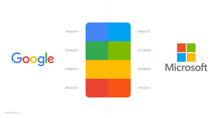
Unless you’ve been living under a rock for the past couple of weeks, you’re probably aware that Google changed their logo (again). This time they opted for a cleaner font, as well as a muted color scheme. At first glance, it doesn’t seem like much has changed; however, Color Hunt Blog quickly pointed out the marked similarity between Google’s colors and Microsoft’s.

To start, it is mentioned that the yellow both Google and Microsoft use in their logos is fundamentally identical. The blog also points out that, while the colors are different on some level, this difference is largely due to the saturation scale Microsoft uses. Google’s plainer, more utilitarian color scheme portrays a flatter palate that adequately conveys the fact that they’re grounded in reality, whereas Microsoft—a digital giant—explores brighter, more complex colors.

So what’s the big deal?

Remember when iOS 7 came out back in September of 2013? All those rounded text bubbles, loading bars, and icons gave way to more angular, uniform, clean-cut presentation reminiscent of—you guessed it—a Microsoft phone. Like it or not, the world seems to ever so slightly gravitate toward Microsoft’s design choices. Here’s why: Microsoft presents a clean, squared-off, aesthetically pleasing interface. Efficiency is inherent in its design; it’s a look that says “I’m all business.”

Whether or not Microsoft actually accomplishes such efficiency is up for debate, but presentation is half of the battle. Our society has moved on from the comforting appeal of Apple’s soft textures and gentle interfaces; one need only take a cursory look at current trends in interior design to know that we’ve entered an era of clean edges and uniform lines.

Personally, if I had the budget and the time, I would certainly consider redoing my entire communications network and entertainment provider with Microsoft in mind — and, as it sits, I’m not alone in that field by a long shot. I think Google is keenly aware of this mentality, and their subtle color changes in this new logo reflect their desire to continue providing information in as an efficient, uniform a way as possible.
#GoogleMicrosoft

Jack Lloyd, Senior Staff Writer
Jack Lloyd has a BA in Creative Writing from Forest Grove's Pacific University; he spends his writing days using his degree to pursue semicolons, freelance writing and editing, oxford commas, and enough coffee to kill a bear. His infatuation with rain is matched only by his dry sense of humor.
Subscribe
Notify of
wpDiscuz
0
0
What insights can you add? →x
()
x
Exit mobile version