Monday, January 19, 2026

Unlock AG Pro Today

Why Now?

AG Pro gives you sharp insights, compelling stories, and weekly mind fuel without the fluff. Think of it as your brain’s secret weapon – and our way to keep doing what we do best: cutting the BS and giving you INDEPENDENT real talk that moves the needle.

Limited time offer: $29/yr (regularly $149)
✔ Full access to all stories and 20 years of analysis
✔ Long-form exclusives and sharp strategy guides
✔ Weekly curated breakdowns sent to your inbox

We accept all major credit cards.

Pro

/ once per week

Get everything, no strings.

AG-curious? Get the full-access version, just on a week-to-week basis.
• Unlimited access, no lockouts
• Full Premium archive access
• Inbox delivery + curated digests
• Stop anytime, no hoops

$
7
$
0

Get your fill of no-BS brilliance.

Pro

/ once per year

All in, all year. Zero lockouts.

The best deal - full access, your way. No timeouts, no limits, no regrets.
A year for less than a month of Hulu+
• Unlimited access to every story
• Re-read anything, anytime
• Inbox drop + curated roundups

$
29
$
0

*Most Popular

Full access, no pressure. Just power.

Free
/ limited

Useful, just not unlimited.

You’ll still get the goods - just not the goodest, freshest goods. You’ll get:
• Weekly email recaps + curation
• 24-hour access to all new content
• No archive. No re-reads

Free

Upgrade later -
we’ll be here!

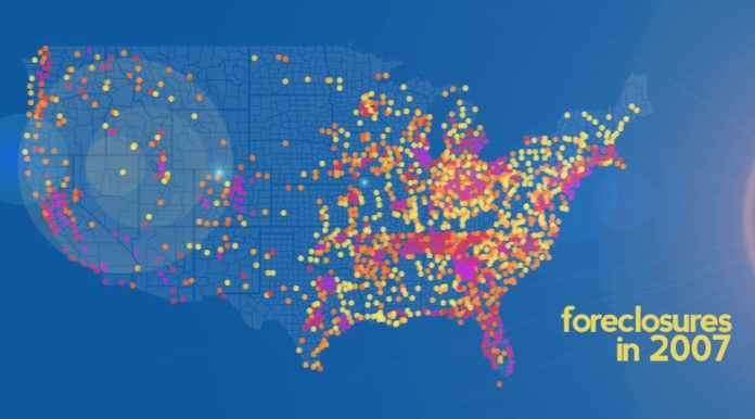
Eye-opening visualization of the viral spread of foreclosures

The foreclosure crisis

As the housing economy continues to struggle, there are small signs of health emerging, which CoreLogic’s Chief Economist, Mark Fleming aptly called housing “finding its footing,” in a report released today indicating that foreclosures have slowed for the fourth consecutive month, yet remain below the pre-recession “normal.”

Some economists continue to warn of a looming shadow inventory which CoreLogic says is actually clearing up. The one thing that is not debatable is that roughly 3.8 million homes have been foreclosed upon since the September 2008 bust, which is not exactly an easy number for anyone to swallow.

In an interactive map The Atlantic is calling “stunning,” the WNYC radio station pulled together years of Realtytrac data in an interactive visual to show the widespread foreclosure epidemic.

Below is the final result of their work, with foreclosure data by county exploding in color indicating the rising rates of foreclosure in each area. The darker the colored dot is, the higher the rate of foreclosure, as indicated in the key.

Tip: click “fullscreen” on the bottom of the map to see the entire nation, and push “play map” to see animation of how foreclosures spread over the years.


The Atlantic writes, “you can see how many more dots show up on the map, indicating a higher prevalence of foreclosures. But perhaps more disturbing, the map displaying the most recent data in July 2012 doesn’t look much better than past maps: The crowded dots maintain the visual effect of a foreclosure epidemic.”

The road to a housing recovery is a long one, and while the sector may be finding its footing, inventory and lending remain tight, prices are improving, there are signs of hope, but many wonder what housing will look like after the elections and after the world has stopped holding their breath.
The American Genius Staff Writershttps://theamericangenius.com
The American Genius is news, insights, tools, and inspiration for business owners and professionals. AG condenses information on technology, business, social media, startups, economics and more, so you don’t have to.
Subscribe
Notify of
wpDiscuz
0
0
What insights can you add? →x
()
x
Exit mobile version