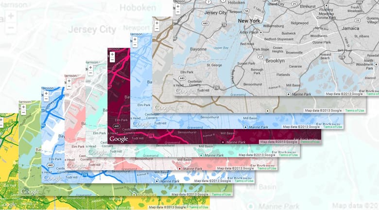

Snazzy Maps color schemes for Google Maps
Since the dawn of the internet, website owners have been bound by the aesthetics of the maps provided by Google, Bing, and others, but with version 3 of the Google Maps API, custom styles may now be applied to maps so your color scheme and the feel of maps you’re using on your site match your actual site.
Enough with the generic yellow and blue combo you’ve been stuck with and to hell with the average map look – you’re not average, and your site is navy and white, so why aren’t your maps?
Enter Snazzy Maps, a repository of custom styles you or your web developer can apply to your site. The site was created by Canadian tech company, Atmist as a way for them to give back to the community. Submissions received are reviewed, and if approved, featured alongside the creator’s name and website.
All of the styles available on Snazzy Maps are licensed under creative commons and are completely free to use. What we find fascinating is that the available maps aren’t just altered color schemes, but different label sizes, and even some artistic versions of topographic maps.
The value of being custom
It goes without saying that standing out requires thinking outside of the box, but sometimes it is more about having a seamless experience on your site so the user is always offered a well tailored visit. When a website features high end jewelry and uses deep purples and white as the main colors, the cream and light blue of a standard Google Map can stick out like a sore thumb.
Aside from aesthetics, what using Snazzy Maps really does is proves your attention to detail – that you care about their experience long before you even meet them. That’s the value of customizing all aspects of your site and partnering with a web developer that cares just as much as you do.