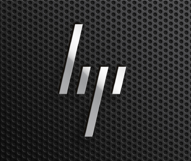
What do you think of HP’s new logo?
If you’ve been a die-hard HP fan from the get-go, be ready for a change: your next laptop won’t bear the traditional “HP” logo. Instead, the legacy brand has opted for a sleeker, minimalist logo, designed by HP’s creative team, Moving Brands.
Why should you care?
As anyone with a background in design will be happy to corroborate, we have moved into a seemingly permanent era of minimalism, from basic marketing and advertising to entire brand names–and you’re going to want in on this movement.
![]()
If you haven’t jumped on the minimalism train already, it’s time to book your ticket. Though a complete overhaul of your logo or advertising might be a daunting task, relax–this is a pretty straightforward design trend.

Minimalism 101
Common aspects of minimalism include straight lines – particularly in the horizontal and vertical – a neutral color palate of greys, white, and black, and, of course, a lack of superfluous detailing. The end goal is for your product to stand out whilst being complemented – but not overshadowed by – the platform, font, or logo upon which it resides.
Naturally, a pertinent example of this is HP’s redesign.
Consider the current HP logo – the same letters inside of a solid circle transposed upon a monochromatic background, as is the case with most laptop covers–and compare it to their new rendition: four 13 degree diagonal lines of differing lengths. It’s simple, it’s clean, and it gets the point across.
Know your audience
Of course, no design system is without its drawbacks, and minimalism is no exception. As pointed out by Web Designer Depot’s Ezequiel Bruni, HP’s drastic redesign may be a little too minimal; were it not for HP’s renowned status in the technology realm, you might find yourself spending more time trying to figure out what “////” means than actually making a purchase.
This concept applies to your business as well: Minimalism, while clearly the current trend, must be balanced with enough overt detail to clue your audience in on what, exactly, they’re looking at.


