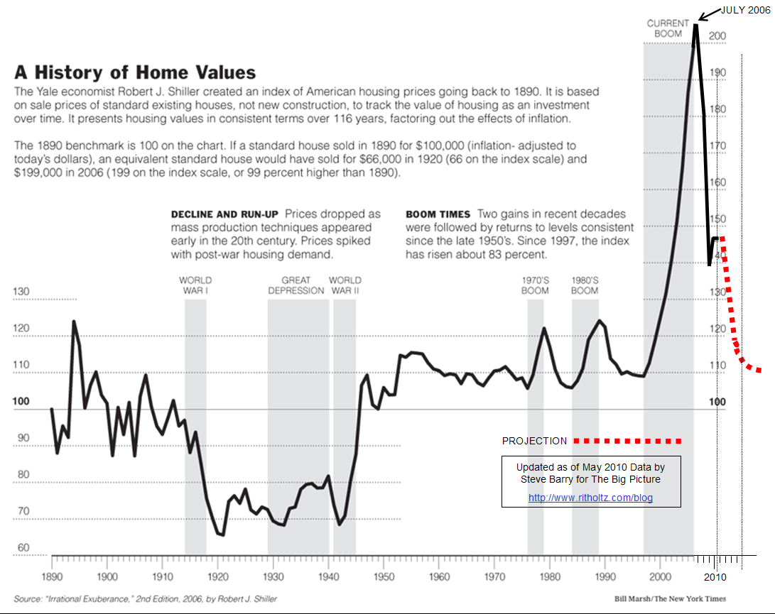
A wild roller coaster ride for home values
One of the leading indicators in real estate is the long-running Case Shiller data that tracks housing prices in the U.S. Each month, we rely on them as a high quality data source and came across a chart of the last 100 years of home values as published in the New York Times.
Economist Barry Ritholtz said in a recent article, “I asked Steve [Barry of the New York Times] to update [Case] Shiller’s NYT chart, now that much of the government intervention has run its course. There is still massive Federal Reserve subsidies in the form of record low rates. But the short term bounce caused by HAMP, Foreclosure abatements and first time home buyers tax credits are mostly over.”
In the graph below, pay close attention to the dips and how big the most recent boom was (which makes a recession even that much more obvious in retrospect, right?).
Click the image to enlarge.