The glory days are over
It seems that the floating action button may soon go the way of the hamburger.
Huh?
If you’re a web designer you probably know what I’m talking about, but if you’re not, let me catch you up.
![]()
What’s hidden stays hidden
The “hamburger” or “hamburger menu” refers to an icon consisting of three parallel lines – like two buns and a burger – used on a website or mobile app to pull down a menu. The hamburger was popularized as a design feature as developers were trying to cram as much information into the slick, slimmed-down designs of mobile apps as possible.
Theoretically, it’s a good idea. It’s a simple menu that allows the user to access more content than can fit on the screen. In practice, however, the hamburger has proved to be pretty dysfunctional. The fact is that people don’t really think about – and don’t click on – what’s hidden, so engagement with the hamburger menu is extremely low. In the words of Josh Constine over at techcrunch.com, “hiding your features off-screen behind a nondescript icon in the corner is usually a poor mobile design choice.”
Mobile doesn’t translate
Hamburger menus are dipping in popularity, showing that designers still have some finagling to do to figure out what actually works best for mobile – our first assumptions often prove incorrect after user testing. What’s more, designers are also finding that what works for mobile often doesn’t translate well for full-size computer and tablet screens.
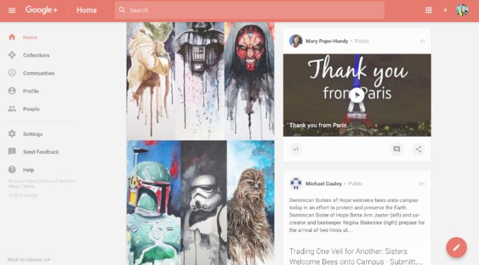
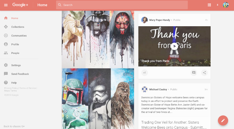
This is also the case for floating action buttons – usually a circle with a simple icon that hovers over other page content in the lower right corner (where your thumb can easily tap it on a mobile device). Floating buttons are a recognizable feature of Google’s Material Design – a design aesthetic created for Google’s branding that has quickly become the go-to for modern web design.
Designers need to keep the user in mind
The floating action button usually represents the “primary action” of the page. Unfortunately, designers too often choose an action that is actually not the most popular user action. The designer has to narrow down an app with several functions to the “primary” function – and often guesses incorrectly which action users will want to take. A conveniently located button that toggles your music playlist is useless when what you actually want is a play/pause button, for example.
The moral: test it out
Like the hamburger menu, the floating action button translates awkwardly to large screens. On a computer, the floating button often ends up on the opposite side of the page as the rest of the navigation. Meaning that, just like with the hamburger menu, people aren’t really going to use it.
Google’s Material Design has some good ideas. But let’s be honest – copying a highly popular site’s design aesthetic isn’t going to make your site stand out.
And more importantly, you want your design features to actually engage users. Design concepts that theoretically make sense and look cute still need to be tested by real users to find out if they are working.


