Looking outside the box for inspiration
Many Realtors are currently in the market for a new website or blog and because real estate is a time intensive career, many don’t have time to research trends or be experts in usability, color trends, modern features and the like, and therefore fall back on the least expensive template design they can find on Google and hope the phone will ring.
Obviously, this is tantamount to putting hot pink flyers that say “I’m a Realtor and junk, call me and stuff 813-555-RLTR” on car windows at the mall. Can you say marketing fail? A hot pink flyer on a hood is just as obnoxious as a website that looks like MeeMaw and the crew put it together on Geocities circa 1997.
Therein lies the problem with the typical course of a Realtor who researches real estate wesbites- they look at what their competitors have and there’s a good chance their websites suck, putting the “researching” Realtor in a bad position, unable to stand out, and likely held back by a poor marketing effort they never intended to fail at.
Looking outside for inspiration
The problem with looking for website inspiration outside of the real estate industry is that it can be confusing and overwhelming. There is no need for a real estate website to look like a dating site or an e-commerce site, but to have a similar framework to an architect or new home builder makes great sense- the DNA is similar.
Architects’ websites
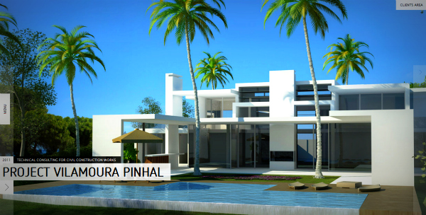
First, let’s look at two architects’ sites to see which you like better (click either picture below to visit the live site):
Which of the two is superior? Which are you more drawn to? We assume we can all agree that collectively, we lean toward the large picture as the landing page rather than the tiny, oddly placed crooked pictures.
What are architects selling? Their design, their services, their project management skills, but most of all, an amazing finished product. Architects are often selling to commercial developers and residential homeowners alike and when we see bad web design, it leaves us as consumers asking if their horrible outdated web design is reflected in their architecture?
Architects that have quality websites are a great place to gain inspiration for your own website be it a new site or a next generation site. They invoke feelings of enthusiasm with big pictures, large fonts and a focus on their products rather than their personality. Architects have to be a trusted resource as a Realtor does, so it’s not a stretch to look that direction.
Inspiration from builders
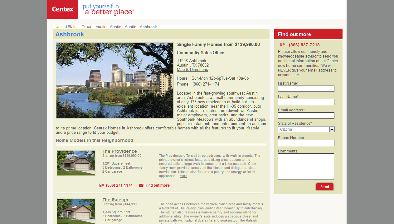
Again, let’s look at two websites and think about which one we are more drawn to from a consumer’s perspective:
One of the above sites is modern and one is outdated. One has a comfortable welcoming feel and one looks a little like a fancy Excel spreadsheet with colors and a few pictures (and a LOT of words). The colors and navigation of Pulte is far more in line with modern web design than the Centex site.
Builders are selling in an extremely similar way to Realtors and Realtors often sell builder inventory. Websites with larger fonts, an emphasis on the homes, and easy navigation without hundreds of words per square inch will perform better as consumers become more educated.
Not only are consumers becoming more educated, smartphones and tablets are making websites look outdated really quickly as developers focus on apps for these devices that are consistently slick, streamlined and easy to use. So take a hint from the Portuguese architect and Pulte builders and focus on large, inviting photos with modern fonts and easy navigation and whatever you do, don’t let your website look anything like this.


