


Adios orchid, hello a unique shade of red
Every year, Pantone names a color of the year, last year anointing “radiant orchid” as the color of the year and “emerald green” the year before. The announcement is relevant because designers of all types – graphic, web, retail and others – follow suit. This is why you saw so many emerald green and lighter purple logos, purses, and websites in the last two years.
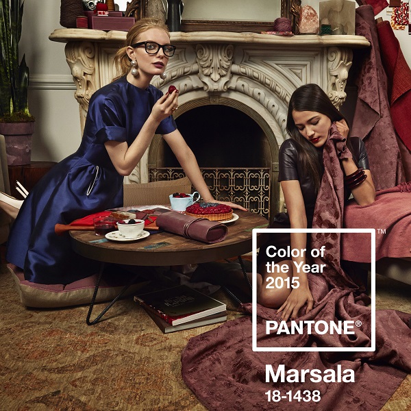
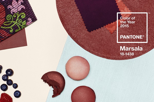
So what will you see a slew of in 2015? PANTONE 18-1438 Marsala has been named the color of the upcoming year, which Pantone describes as a “naturally robust and earthy red,” and the rich wine hue is meant to embody “the satisfying richness of a fulfilling meal” that emanates “a sophisticated, natural earthiness.”
![]()
Pantone Color Institute’s Leatrice Eisman said, “This hearty, yet stylish tone is universally appealing and translates easily to fashion, beauty, industrial design, home furnishings and interiors.”
Pantone collaborated with Sub Rosa, an “experience design agency” to create a photo collection to convey the color as that of friends coming together over food and drink. The elegance is portrayed through the campaign images as seen below:

How this all applies to you
According to KissMetrics, fully 85 percent of shoppers point to color as a primary reason they buy a product and color increases brand recognition by 80 percent.
Online, 42 percent of shoppers base their opinion of a website solely on the overall design. Again, if you are not using a color scheme that appeals to the majority, you could be losing business solely on your color choices.
A whopping 52 percent of shoppers did not return to a website because of the overall aesthetic; more than half of your customer base could choose not to come back because they did not find your color palette appealing.
Marsala or not, you should be paying attention to colors as it relates to your brand.
