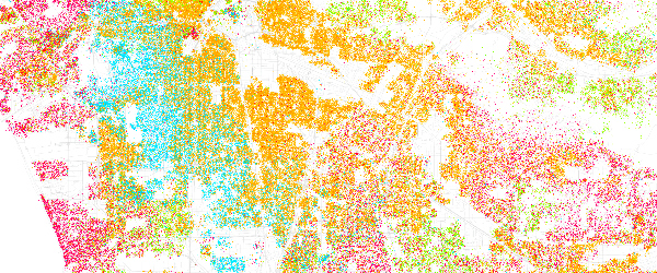
 As the art of infographics is rapidly improving, many are turning to more detailed information to visually graph as computer programs become more equipped to create beautiful, artistic, easy to understand visuals.
We’ve brought you a variety of infographics over the years and I ran across a set today that really caught my eye. This infographic set highlights race and ethnicity based on census data and it is amazingly well done.
According to the Eric Fisher, creator of the image maps, “Red is White, Blue is Black, Green is Asian, and Orange is Hispanic, and each dot is 25 people.” I very much enjoy seeing the diversity of these cities and how the rainbow blends and hope that with the completion of the next census, these reds, blues, greens and oranges are even more blended!
These are the 40 cities highlighted in the infographic set:
- Albuquerque
- Atlanta
- Austin
- Baltimore
- Boston
- Charlotte
- Chicago
- Cleveland
- Columbus
- Dallas
- Denver
- Detroit
- El Paso
- Fort Worth
- Fresno
- Houston
- Indianapolis
- Jacksonville
- Kansas City
- Las Vegas
- Long Beach
- Los Angeles
- Memphis
- Milwaukee
- Nashville
- New Orleans
- New York
- Oklahoma City
- Philadelphia
- Phoenix
- Portland
- San Antonio
- San Diego
- San Francisco
- San Jose
- Seattle
- St. Louis
- Tucson
- Virginia Beach
- Washington, DC


