


Overview
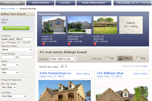
My general thoughts on the new and improved Realtor.com is that it is modern in appeal. I am surprised, however that they opted for a narrow width rather than a 1024 px wide screen to better take advantage of the valuable real estate on the landing page, but narrow width is acceptable in today’s web2.0 world. I really do enjoy the fade blues and grays that compliment the association’s branding as well as the rich blues and grays that do appeal to a buyer in that it sets a comfortable setting in which to relax and search. I would, however, warn the designers that muted sites do not work well in enticing buyer enthusiasm, so I would highly recommend they punch up the minor details that pull a content consumer more deeply into the site. Colors that sell links are needed to capture curiosity and a monotone page just doesn’t do that- you’ll note the green “save the search” box and red houses that indicate a Featured Tour in the next image- notice how they very subtly sell you inward to do something?
Search
Search is simple from the front end and I am very glad Realtor.com did not go off the deep end on mapping. From conversations I’ve had all around the country with idx developers, map searching is highly overrated according to the data and not actually in high demand by consumers. I have not seen this data, but it seems to be a concensus among several that what is most appealing to consumers is the ability to switch to mapping when necessary and Realtor.com answers that call either way- consumers also want pictures, and lots of them, and again, Realtor.com does it very well actually.
As you can see from the image above, Realtor.com answers to it’s advertisers (Listing Agents) with Featured Listings but I am not sure that placement is a good idea over all. I would almost prefer there were no blue featured box at the top. In my mind it would almost be better if the results were shifted up, and the top 4 results were in blue. This creates a more seamless results page that takes the buyer on a journey rather than confusing the home seeker. This is more of a preference, but not a requirement, but none the less, you’ll notice the user’s ability to switch into several views. This is an area I would suggest colors that sell links explaining to the user that there are options- thus building time on the site and user comfort. Overall, I love the large result boxes with big beautiful images framed with a fantastic contrary colored font that delivers the information the consumer is looking for.

Detail Results
A very clever results page advertises the listing agent very well by giving them plenty of valuable real estate on the page. It is hard to miss a well laid out bio. Large beautiful images meet the end user, increasing the overall experience and delivering the seeker to the email contact button. I, for one, would prefer more emphasis be placed on direct contact information such as the agent’s phone number. Another interesting feature is the “days on this site.” This lately has become an issue of great debate and I am glad to see “days on market” continue to be devalued in this fashion. Also notice on the right, below the agent’s logo, you will find the agent’s other listings- this is a valuable resource for the agent and the home seller as it adds additional exposure to all listings, and we all want that.
I am not sure I appreciate why the Brokerage information is listed along side the agent’s information in such grand form. I’m not listing homes to make the office phone ring in every case, so I am hoping this is a feature you can disable or devalue in some way.
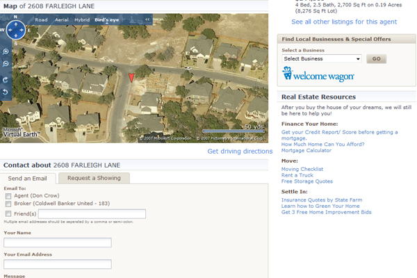
Mapping Feature
Ah, the moment of truth. Realtor.com opts for Virtual Earth (thank you) complete with bird’s eye view of homes. This is a personal choice on my part, but VE is just a much prettier map and interface. Although you’ll not enjoy the use of Google Street View, I have a feeling it will not be missed. The search feature is as fast as it is nimble and I believe over time this system allows for flexibility and growth.
Again, I would note that email contact seems to be the most emphasized and there is a lack of a phone number at this end of the page. This may be a mistake only if the buyer is looking for it. Why confuse them or force them to scroll up when you could simply fit it in?
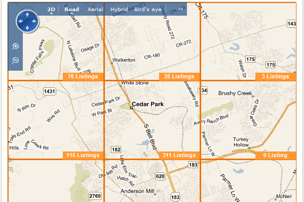
The Grid Search
Realtor.com does introduce it’s own way of assisting home buyers narrow down their map with incredible detail by allowing a grid on general searching that gives the user a head start in locating areas with listings. I would really need to play with this feature a bit. I am really not sure what value it (grid results) brings as there is no populated area information, school districts, or anything I can see that really ads to the search, but I could be missing something with this one.
The Wrap
Here are my suggestions:
- Better links that sell.
- More emphasis on agent phone contact.
- Pull together results to better lay out a path for the the home shopper.
- Better emphasis on toggle options in results.
- Brokerage contact information on results pages should be devalued.
Overall
I think the new Realtor.com site will delight users as it is a quick load, and the size of images and sheer quantity of images will give the consumer the visuals they really need to complete a more concise search. I also believe Realtor.com made the correct choice in not giving the map the dominating real estate on the page. I believe that users will not care all that much about the missing Google Street View as I am hearing from consumers more and more that they’re not to hot on the idea of their home being visible to anyone who wants a peek.
I do think that Realtor.com is lacking in the fun factor department, as there really isn’t anything here that isn’t found other places online. In saying that, consumers who are serious about compiling neighborhood information, homes in their budget, and want the best visual experience, they’ll find it here on this no fluff, just the facts search site. I will more thoroughly review the new Realtor.com once it is fully operational and during more peak hours, but for now, I can say that Realtor.com answers serious home hunter’s needs, it isn’t confusing or loud, and it is well designed to feature your listings as well as your professional photography. I did notice that poorly thought out images agents upload that are undersized or just bad in general stand out like a sore thumb in this image feature environment, so beware.
