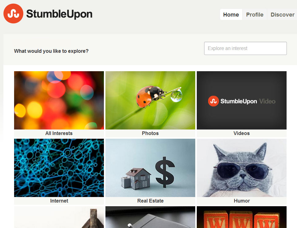
Major facelift at StumbleUpon
Last month, StumbleUpon announced that they account for half of all social media traffic in America and users stay on sites they have Stumbled for longer than the average viewer spends on a site, and the life of a link shared on StumbleUpon appears to have a shelf life that is a lot longer than the other social networks. In October, we reported that StumbleUpon hit 20 million users and has over one billion stumbles per month and continues to grow. StumbleUpon has been the social media darling of late as it drives more traffic than other social media sites and although the flip side of the coin is that quality trumps quantity, the infographic below by StumbleUpon is extremely impressive.
Now, StumbleUpon is finally unveiling their new site design, including a new logo and a new Stumble bar. The logo is a far departure from their traditional green and blue and they’ve gone with a much more modern font and color as seen above. The homepage is now organized as a tile interface so your eyes can scan more quickly rather than having to pour over tiny 12 point font links in list form.
The design has gone completely minimal which is a hot trend in web design right now not just because it’s sexy but because mobile use is skyrocketing and users are no longer interested in zooming in or out, rather, they expect a browsing experience on a website to allow them to scroll down a page no matter the size of their smartphone or tablet screen.
StumbleUpon also has new profile pages and the StumbleUpon bar has been stripped of the small fonts and moved toward a more Google/Gmail like design with the black bar that has symbols only rather than words, a smart move in our book. The site is much easier to use and the bar is much less harsh on the eyes, we think the redesign is perfectly in line with the hottest web development trends and although we already use StumbleUpon, this could help the company grow even more rapidly than they already are.


