

 This post may fall on deaf ears for most regular Agent Genius readers and that’s a good thing. Most of the regulars here are completely on their game and have some of the nicest most beautiful and effective web sites in the business.
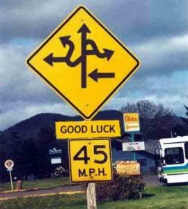
However, this AG group represents only a tiny percentage of the real estate web sites out there, and we’ve all seen a bunch of interesting sites to say the least!
Personally, I enjoy checking out web sites. Any time someone leaves an interesting post on one of the 30 or so blogs I subscribe to, I typically click through and take a look at their site. You can get all sorts of ideas for use on your own site by just looking at hundreds of other sites.
Whenever I see a really bad one, what that says to me is that the person behind the site has a very low attention to detail. Also, they are apparently not overly concerned about their on-line credibility, as is being conveyed by their website.
I think we all know why on-line credibility is important, but just in case: if you are seeking leads from your web site and your site looks like garbage, then the potential lead will likely come to the same conclusion and hit the BACK BUTTON!
This business is already competitive enough without running potential leads away from your site!
Ok, so what are some of the major factors to be aware of and possibly improve upon to increase your online credibility?
Navigation – When users are on the hunt for something, if they can’t find it within a few clicks, they are outta there, period. This has been proven time and time again and I do it myself. If your main lure is the ability to search homes, then this needs to be above the fold, top left or center, and big, not buried in some horizontal navigation bar.
Design – Is your site ugly, or is it shiny, attractive, pretty and interesting looking. Does it say “look over here, and here, and here, this stuff is interesting and attractive” or does it say “I was designed in 1999 using WordPerfect?” Let’s face it, web sites are not people so surfers are not going to dig any deeper to see if there’s a good personality hiding inside. Ironically though, sites do represent their owners, who will end up with the same treatment as the site!
Error Free – This is so self explanatory, it’s tough to type here. However, let me assure you that there are many sites out there with: misspelled words, broken page links, functions that do not work, missing images, misaligned elements, incomplete pages, inconsistent fonts, etc., etc.
I’m sure as a web developer myself that I’m harsher than many, but when I see ANY of the above error items, I usually laugh or shake my head, mumble something like “you gotta be kidding me” and click away ASAP.
Theme, Logo, Brand – Every site should have at least one of these. For most real estate sites, this is not an issue as everyone has a Broker and this information is required to be on the web site, so there’s your brand. But this is the minimum and I recommend trying to come up with at least a logo or something to be remembered by. Sites without any branding whatsoever are going to be pretty bland.
Hit the Target
There’s no magic bullet here but if one can avoid at least the most basic mistakes above, this is a great start. Recently I saw a site that was so simple it was laughable, but the site was unbelievably beautiful and its main reason for being was right across the entire top of the site – probably quite effective.
Oftentimes, visitors are not looking for everything slightly related to their target; they are looking only for their target, and as fast as they can find it. Design your site for these folks. The rest of your visitors, the lookie loos and curios types will find everything else on your site on their own.
