The real estate industry is comprised of hundreds of thousands of people, many of whom have no background in advertising or marketing which means that sometimes the independently launched marketing campaigns lack polish.
So let’s take a quick peek at some easy ways to jazz up your marketing and the example below is a flyer that was in front of a house as the marketing collateral… I point this out because you may not now how ridiculously common it is for people print the MLS listing and put it in a flyer box in front of a house and it looks like this:
Making it So Much Better
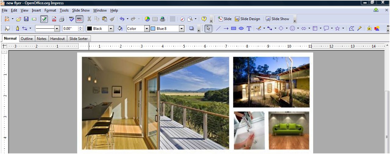
Oh this won’t do. Any effort you make is better than this, but let’s awesome-ify this flyer in under 30 minutes (60 for the over-perfectionist-tweakers). First, get the best images you have of the home you’re listing (I prefer professional photography), you’ll just need four. Open your Power Point, Open Impress or Photoshop, whatever it is so you can simply slap up some images. Insert the four photos into a new document and resize it to look like this (with your favorite shot as the lead):
Now For the Pizazz!!
So this is the cool part- under your pictures, we’re going to add the pizazz! Go to the Idee Inc. Lab and click on the color palette on the right which will populate creative commons images (images that are legal to use) from Flickr that have the color(s) you select! For this flyer, we’re going to select two shades of green because we’re featuring a sustainable home but for your flyer, you may be advertising a brownstone building so you would select browns and tans, or you may be publishing materials for an oceanview property so you’d select aqua and navy.
Bringing It All Together
So now we have an awesome palette and to grab it, use your screenshot tool to capture the image. Now, we’ll pull the image you just created and put it into the document with the four images you already gathered:
And Voila!
Now either select all the images and group them and save them as an image by right clicking and “save as image” (or in Photoshop, just save the image). Now open up Picnik (the Flickr photo editor) which I use as a substitute for Photoshop. All I did was crop this image, add the word “GREEN” in white and faded it 30%, used a clean font to very simply line out the details but I don’t show the price. Why? Price changes lead to reprints and if you’re using high quality paper and you don’t want to kill extra trees, don’t list the price. Why else? Because the most important detail on this flyer is the web address at the bottom- flyers only give you the possibility of analyzing metrics if they direct a buyer to the website. Here’s the final product:
The Most Killer Idea OF ALL!
The flyer above can easily be created in a large format, sent to your local sign shop and printed as the yard sign for your listing. Now THAT is a killer idea- it’s unique, very attractive, eye-catching and can be printed as a two-sided sign that impresses your sellers and your buyers, it’s a win win win! If you and your seller are eco-conscious, the flyer can also be shrunk down to business card size and printed as business cards… there are now business card holders that can be attached to signs that are weather resistant and with business cards, sellers can carry a stack of those bad boys with them and hand them out- brilliant!
Show Us Whatcha Got!
This project took me about 15 minutes to make and I’ve got something that stands out which all home sellers deserve even if their home is only selling for $30,000. I invite you to use this layout, make your own, but try to experiment and get away from the 1990’s standard templates that have come and gone… be brave with graphics, fonts and layouts! If you use any of these tips above in a flyer or have more to share, leave a link to it in the comments, we’d love to see!
Originally published September 13, 2008.
Lani is the COO and News Director at The American Genius, has co-authored a book, co-founded BASHH, Austin Digital Jobs, Remote Digital Jobs, and is a seasoned business writer and editorialist with a penchant for the irreverent.
Gus Rojo aka: Mr_Monopoly
September 13, 2008 at 8:58 pm
Great piece Lani, bout time someone speaks up about improving old school marketing!! We’ve had a lot more success spicing up our collateral pieces, especially in our market (UT Austin) where we push a lifestyle brand (aka. “The Good Life”). Here’s a lil preview of our work:
westcampusliving.com/docs/West_Campus_Living_2008.pdf
Laura Cannon
September 14, 2008 at 12:09 am
Thank you for sharing this! This is a great inspiration!
Ben Goheen
September 14, 2008 at 12:55 am
Great tutorial Lani – hopefully I’ll see agents using techniques like this instead of just printing up the MLS listing.
Steve Simon
September 14, 2008 at 6:04 am
Sadly, the gift you displayed is not easily transfered…
I have other gifts, but not the “Artistic gene”…
I know that yours looks better and can discuss why, but I can’t create from scratch…
I could probably come close if I looked at the good example and then imitated it; but the color groups might be questionable!
For those like me, there things like “Templates” 🙂
But one does have to admit, your flyer isn’t even in the same zipcode as the first!
Wish I had that gift!
Jess
September 14, 2008 at 10:59 am
Nice job! Makes it easier for those individuals that don’t have the “big” software tools available to them.
Derec Shuler
September 14, 2008 at 11:00 am
Nice piece and super easy, at least you made it look that way !!! @derecshuler
hilton
September 14, 2008 at 11:05 am
Damn Girl!
Bill Lublin
September 14, 2008 at 11:12 am
Lani:
This is awesome (especially the point about using flickr for the cool faded text – But what can you use for cool screenshots if you are not on a Vista machine? (And therefore don’t have the snipping tool)
Lisa Sanderson
September 14, 2008 at 11:22 am
Wow. You’re my hero. I am so trying this.
Lani Anglin-Rosales
September 14, 2008 at 11:25 am
Bill, check out the comments of the Snapshot article. From what I understand, there are tons of free screenshot tools online. 🙂
I’m glad everyone’s enjoying it, please feel free to rip it off, this is not a real property I featured, rather a template created. 🙂
Bob Schenkenberger
September 14, 2008 at 11:32 am
Bill, I use the Jing screenshot tool. https://jingproject.com. It’s easy, powerful, and free.
Matt Rains
September 14, 2008 at 12:55 pm
I love the ad but since the images are pulled randomly by flickr is there a chance of an inappropriate picture in the mix?? I can’t see it very good but is the picture in the top left corner, first row second from the right of a man streaking? HAHA
Great Post.
Matt Rains
Ismail
September 14, 2008 at 1:02 pm
The ad looks amazing, its good to know that you can make such outstanding ads in a short period of time.
Lisa Sanderson
September 14, 2008 at 1:06 pm
LOL I am not ashamed to admit that Matt’s comment made me come back for a second look. Any chance we could have this emailed to us in a larger, higher res file?? ^^
Brad Nix
September 14, 2008 at 2:01 pm
While we’re sharing cool tools to use…I suggest Realtors try https://www.getpaint.net/ as a FREE replacement for photoshop and https://www.jingproject.com/ for screenshots. Nice Tips Lani.
Lani Anglin-Rosales
September 14, 2008 at 2:05 pm
Matt, Lisa, behave yourselves, it’s a soccer player. They’re known for wearing shortie shorts!
Brad, thanks for adding those tools to the mix, those are great!!
Steve, you’re right, it’s easy for those with an innate graphic eye to forget that it’s not something everyone has. I spend a lot of time studying marketing and graphic design and we analyze print, web and television marketing all the time for fun AND for professional reasons. It’s like writing- it takes practice. 🙂
Daniel Bates
September 14, 2008 at 2:27 pm
I couldn’t agree with you more about lame print advertising. You spent more time on this one than most agents do in an entire year. And then there was the one I saw yesterday that was a beautiful folding brochure for a $2M house that was beautifully laid out but every picture used was so pixeled that it defeated all their effort. 1) Get a good camera. 2) Learn to use it. 3) Learn Photoshop or at least Paint! 4) Learn Word or some other layout program. 5) Succeed!
Vicki Lloyd
September 14, 2008 at 5:35 pm
Lani –
Your example came out great. I can’t wait to try something similar on my next brochure! Thank you.
Jason Sandquist
September 14, 2008 at 6:30 pm
I have a REAL pizzazz, it’s the greatest invention ever, would not have made it through my early years with out it. Oh, BTW the idea is awesome, will experiment a lot with it
Matt Rains
September 14, 2008 at 7:06 pm
Lani,
I thought it might be a soccer player then I went and tried the “Alamy Set” and a naked pregnant woman came up exposing everything god gave to her. I guess that wouldn’t exactly work but as long as I stick with Flickr I should be fine.
Thanks for the great post your a revolutionary inspiration to us all.
Matt Rains
Lani Anglin-Rosales
September 14, 2008 at 7:43 pm
Matt, thanks for the compliment but as for the remainder of your comment, since I’m not sure what you’re getting at, here are some answers to your objections:
I hope this helps 🙂
Jim Rake
September 15, 2008 at 5:57 am
Lani – I can always use better ways to market. Of course, what you accomplished in 15 minutes will certainly take me a bit longer.
Steve Simon
September 15, 2008 at 8:37 am
Afterthought… I like the Snipping tool almost as much as I like the rest of the creation…
Your post gives great value to the reader, and your style is comfortable to view.
Well done, again:)
Mark Eckenrode | HomeStomper
September 15, 2008 at 10:11 am
way cool tip, lani. and stellar end result that’s pleasing to the eye, stands out from all the sterile-looking fliers, easy to consume, and targets a specific type of buyer.
Matt Stigliano
September 15, 2008 at 2:25 pm
While we’re speaking about photo editing software tips…for anyone that uses a Mac and doesn’t want to blow their cash on Photoshop:
Gimp
I love open source, have I mentioned that before? I’ve only started to play with Gimp, but so far so good.
As for the flyer, I’m so happy to see something on this subject as I feel real estate flyers are boring. An MLS printout with one photo and lots of abbreviations isn’t going to sell me a house when I’m driving around looking at them (my new MLS doesn’t use the abbreviations, so at least we have that going for us). Even when I do open houses for other agents, I always make custom flyers (even if they’re template based, they’re better than what most people are used to) that showcase the property better. I want people to go home and have something they can look at and helps them remember what they saw, not just wind up in a trash can somewhere.
I’m not sure about the price part though. Although I see what you’re saying about that, I know that when I’ve been looking for houses I tend to get annoyed that someone didn’t put a price on a flyer and feel as if I call them I’ll get the “hard sell” just while trying to get a price out of them.
Tim
September 16, 2008 at 10:22 am
Lani,
Thanks for a great idea, although I’m sure it’s going to take me more than 15 minutes until I use it more frequently. Still worth the time for the impact you can get.
Steve
September 17, 2008 at 3:45 pm
Awesome. Loved it!
Craig Barrett
September 17, 2008 at 5:20 pm
Thanks Lani. I tried it out and made a good looking flyer. I passed it around the office and got a couple of hmmm, that’s pretty cool… How’d you do it?
Lani Anglin-Rosales
September 17, 2008 at 6:41 pm
Daniel- great tips! You’re right, sometimes things overlooked can shoot you in the foot!
Vicki- drop me a note when you do, I’d love to see it! 🙂
Jason- please don’t make me google stuff, you know I hate that. lol
Jim- don’t worry about how long it takes you, everyone’s different. I write articles much more quickly than others but an email may take me double the amount of time as you would (tweaking, retooling, etc).
Steve Simon- thanks! A lot of bloggers assume that readers have already stuffed their brains with what they have and take their accumulated knowledge for granted. I’m glad that tip helped you!
Mark- is there anywhere you would *not* advise a flyer like this? It’s universally successful here in Austin but perhaps it wouldn’t go over well elsewehere?
Matt- if you have 100 listings (I’m not a Realtor, so I have 0, but hear me out), it becomes tedious as price alterations are made and stacks of flyers are wasted (or recycled if you live here) and print costs amass each time agents have to reprint. My personal opinion is that if you have a large enough assistant staff or a low enough number of listings it’s reasonable but with massive numbers of listings, it’s a time saver.
Tim- The first few might take you longer but after you get the hang of doing it, like any project, it gets easier and you’ll get faster. 🙂
Steve- hooray!
Craig- I’m glad you used it, would other unique templates be fun for you to see?
Mark Eckenrode | HomeStomper
September 18, 2008 at 11:05 am
@lani – i can’t think of any place that i wouldn’t recommend a well designed flyer. in fact, something like what you’ve shown here will no doubt open new distribution channels for folks due to the quality of design alone (impressions matter)
Postcard Printing | PrintPlace
September 30, 2008 at 4:22 pm
It’s hard to believe that those great pics came from that house. At first I was going to comment that I’d rather see a shot of the outside of the house in one of those four pics, but the house looks so plain from the outside that I think going with inside shots to draw people in would definitely work better than putting an outside shot on flyer. I really like the hierarchy of the photos too. Simple, yet I know what to look at first. Inspiring!
Postcard Printing | DesignsnPrint.com
March 25, 2009 at 4:01 pm
This is a great inspiration! Thank you for sharing this!
James!
August 21, 2009 at 10:02 pm
Very good piece of literature. Thanks for the good ideas. We have also tried to establish a “culture” or “branding” with the phrase “love where you live!”
You can check out our culture as we try to improve on our presence at utluxuryapartments.com
tomferry
September 21, 2009 at 5:27 pm
Lani– the title of your post- pure genius! Thx
Karen
November 8, 2009 at 3:02 pm
I love this! I can’t wait to go play with this new tool!
Ruthmarie Hicks
July 17, 2010 at 5:43 pm
Hi Lani,
It’s interesting..I use “business cards” more than fliers. But I mostly do condos and coops right now and I can leave the business cards about the unit with the concierge and in local cafes and restaurants and stores etc. I find I am able to spread them around more as merchants are not worried about them cluttering up the place.
I use the “faded” picture on Picnik for them and print on top of them – it can be tricky to get a clear effect – then on the back is a “bullet” of the listing information. I’d show you an example, but I don’t know how to upload to you.
Nick Nymark
July 17, 2010 at 7:46 pm
Great Article! Will Definitely have to try!
Property Marbella
July 18, 2010 at 1:18 am
Good and interesting article, many new things to look over and test.
Michael Bertoldi
July 18, 2010 at 1:22 am
Awesome piece Lani. Not much else needs to be said. This is inspirational and I can’t wait to try this format.
Fred Romano
July 18, 2010 at 7:53 pm
First – I am amazed at how quickly this post got ranked by Google! Love the idea for the flyer but I rarely print anything nowadays.
abraham
August 12, 2010 at 10:49 pm
Great article.
Here’s my example inspried by your artwork.
https://neworleans.craigslist.org/reb/1895512064.html
I made the entire picture a link back to my site on craigslist. I can see a tremendous amount of traffic coming from this ad, compared to my other ads (postlets, html, plain print).
Thanks for sharing.
Lani Rosales
August 13, 2010 at 12:36 am
Abraham, that is fantastic! It looks great and I’m so glad to hear you’re seeing results!