


 If I was truly a genius, I would have more facility with Excel and understand statistics better. But I’m not, so my clients have to suffer with me putting what I know into layman’s terms – which, as it turns out, isn’t so bad because the majority of our clients are not rocket scientists nor statisticians either.
In fact, the majority of our clients seem quite pleased when someone explains something to them in plain language they can understand.
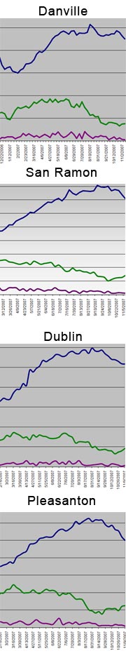
If a picture is worth a thousand words, then a good graph must be that times two. The image to the right is updated every week on our site. We collect data from twice as many cities, but these are four of the main communities we service.
These graphs come in handy throughout the year, but seem especially useful as we approach the end of the year. They are useful for both buyers and sellers as they allow us to explain seasonal patterns and how that may affect their situation.
The data used is pulled each week from the local MLS. These charts are different from the other charts on our site. Those scrape data from the Internet and then formulate it for local real estate market trends and insight.
These charts represent our number one source of leads. We get two to five leads a day from people wanting to know more about what is happening with local real estate. Most of these people don’t want to talk to us, they just want information. We give it to them free of charge – like you do.
 When we call to see if they received the info, they have questions. Because, like me, they are not geniuses either. They’re smart, they want information, they want to understand – they want knowledge. They just don’t want to be hounded or hassled.
If you’re an agent, you probably get about 54 local mortgage brokers sending you their canned reports on the financial markets. I get more graphs and more high-falutin’ language than I could sort out in a month – if I had the time. I’ve asked over 8 of these mortgage brokers to break it down into layman’s terms for me and our clients – none of them seem to be able to do so. They don’t seem to read or understand the information they are spamming me with.
I say spamming because none of these people asked me if I wanted their newsletter or reports. We exchanged cards at some point and they consider that as permission to send me whatever they want. Some are actually offended when after my personal 3-week trial period, I ask them to remove me from their mailing list. (I see I am veering off point here.)
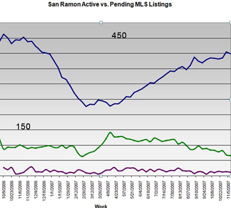
Below is the San Ramon graph with data from October of 2006 forward. The blue line is active listing; the green pending sales. Many of you use similar charts as well. It doesn’t take a genius to recognize the value of how to communicate simply and effectively, does it?
Now if I could just translate that skill into blogging!