


“If 70% of buildings were built like most Web sites, most of us would live and work in tents.”
First impressions.
Ever notice that Trulia and Zillow have more or less the same layout on their front page? And to a lesser degree, also Estately, Cyberhomes, Terabitz, Homes.com, and ol’ Realtor.com? Notice what they put in their prime screen real estate?
Then again, they’re not trying to secure buyers and sellers, they’re just providing information, and making money off of ads and off of agents.
HomeGain is different – they put their “pick a REALTOR” feature into the same space as their “find your home value” feature: dead center, just under the top navigation, the prime page real estate for the web viewing eye. Guess what drives their business model?
Just for kicks, let’s look at that prime real estate on the top 5 Google natural search results for “Tucson Real Estate.” We’ll blur contact information to protect the innocent.
First up:
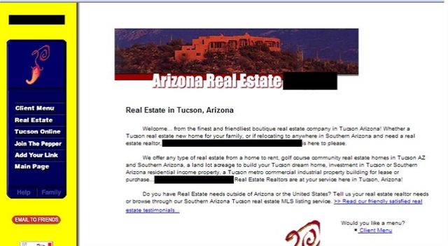
Mmmm…. love that big block of text where some more immediate WIIFM could be answered. Is this Arizona real estate or Tucson? Are only luxury homes served, based on the picture? (side note: took me 6 clicks to find a real estate search, and then it just fowarded me to our public MLS search.)
Second:

Everyone’s favorite stealth site. They mention the brokerage in small text at the bottom, and the whois doesn’t list actual people, has a P.O. Box as an address, and the phone numbers in the whois are no longer in service. But, we do hit a pretty picture right off – good emotional appeal. The search is odd – I just type in any word? Okay, how about ‘bedroom?’
Third:

Wow, there’s a lot of stuff going on there. Focus is all about the agent, the team’s designations, contact information. There are 2 more levels of icons below that first row. I get the impression there’s a lot of info here for me, but it takes me a while to figure out where everything is. I’m already overwhelmed with choices and colors.
Fourth:
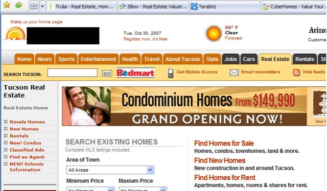
I searched for Tucson Real Estate. What the heck is this? Sports? Health? Condominiums? Ah, there’s the MLS search. Right below the huge banner ad for condominium homes. I reloaded the page a couple times to see some other ads. There are ads just below the side navigation and off to the right as well that keep flashing and flickering. So very distracting from the reason I came to the page: to find real estate in Tucson.
And Finally:

Hang on – is that multiple search options right in prime screen estate? With a nice picture that could be from a wide variety of price ranges? Why, I believe it is! Hold on – is this Arizona or Tucson? (whoopsie: forgot to black out one of the names there. Full disclosure, this is my brokerage, Long Realty.) I still think it is too busy, and the search imposed over the picture is a bit difficult to read. But there are a lot of things that are right.
What is your website’s first impression? Are you spending your prime screen real estate wisely?


Steve Belt
October 31, 2007 at 9:55 pm
Kelley-
I know my business card website is bad, so thanks for reminding me to do something about it soon. It’s up for redesign here very, very soon.
Lani Anglin
November 1, 2007 at 3:02 am
I love how you’ve analyzed these first impressions- we’re in a blog world where everything seems pretty but the moment you step out of Word Press, most sites really really really suck in the RE industry 🙂 Thanks for the reminder for everyone to evaluate their landing page!