Gmail remodeled
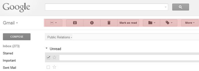
Last fall, Gmail unleashed a redesign of the free email service, offering a more minimalist, streamlined design based more on icons than words on buttons, mimicking the international move toward mobile device design and consistency between products. Gmail functionality was also changed, for example, navigation changed and unread emails became featured above unread emails much like Outlook users are accustomed to.
As with any redesign of a commonly used tool, there were fans and critics, and in one case the critics have won. The icons used as navigation have been reportedly difficult to use for vision impaired users, not only in determining which icon performed which task, but the memorized locations changed, making usability near impossible for some. The icons for “Archive” and “Move” were shown to be particularly difficult to distinguish between for those with vision problems.
New settings option offers text buttons
It is likely this reason that Google has added a setting in Gmail that allows users to switch from the toolbar filled with icons back to a text-based menu which reverts the buttons to the former phrases used, although the order does not revert to the original settings.
To access the settings change, click the grey gear icon near the top right of the page, and select “Settings” near the bottom of the menu. That will automatically open to the “General” tab and the ninth item down is “Button labels,” which defaults to “icons” but can be reverted to “text.”
On a smaller screen, the toolbar will then appear larger and while the screen does become cluttered, text options are clear and evident. This simple step is a huge leap toward accessibility which will usually trump user experience, but Google has done a good thing by offering both icons and text depending on a user’s needs or preferences.
Marti Trewe reports on business and technology news, chasing his passion for helping entrepreneurs and small businesses to stay well informed in the fast paced 140-character world. Marti rarely sleeps and thrives on reader news tips, especially about startups and big moves in leadership.


