Don’t lose biz because of your blog design
In the arena of content marketing, fewer titans loom larger than the company blog. With engaging, informative, and timely blogs, businesses can establish themselves as thought leaders and provide a valuable resource to their customers and attract significant traffic to their websites.
While quality writing is crucial, another component of an effective blog is its visual content. According to GetResponse blogger Sara-Ruth Wolkiewicz, any company should be able to create a visually compelling blog with the use of one or more free tools.
![]()
Whether your firm invests in an elite designer and development team to construct the best blog money can buy, or a few savvy inside personnel team up to create something clean and navigable, visual appeal is vital.
Unfortunately, many companies make grave errors when it comes to visual design. Their sites are not just irritating to the customer’s eye, but bad enough to turn readers away completely.
Take a look at some of the primary mistakes companies have made while blogging, if you want to preserve your readership.
Common design pitfalls of company blogs are outlined below:
1. Generic stock photography.
Customers perceive stock photography as a cheap trick. When a business does not take the time or have the means to create honest and real images for its website blog, it gives the impression that the company is careless.
Perhaps visitors wonder whether the company is worried about how proprietary images would look. Would the business seem less professional and savvy if you saw it in its real light?
Stock photography also does not necessarily convey the purpose or meaning of the blog content. It can make the content seem thrown together or unnecessarily misleading.
2. A lack of images.
In addition to the gaffe above, some companies publish all their blog communications without any images. Websites that lack visual richness often suffer the worst bounce ratings.
To combat this problem, hire a professional photographer to take fabulous photos of your facility, products, services in action, or anything else that represents what you do well. Release them gradually, with new posts, to get the most out of your investment.
If this is not workable, take your own photos! Customers forgive an amateur photo as long as it is appropriate, clear, the right size, and loads quickly.
3. Inconsistent or unattractive color schemes.
This can be serious. Inconsistency causes customers to recall a valuable tidbit they read in your blog and wonder where they read it.
If the answer doesn’t come to them, they may scour your competitor’s website in search of this useful information. If you keep your look consistent, customers are better able to remember your stellar content from its familiar, trusted source.
An unattractive color scheme can drive potential customers away from your website. While attractiveness is somewhat subjective, some color combinations are almost universally repellent, including those that are scathingly bright or conversely dim and overcast, or those which are unreadable.
4. Inappropriate or difficult-to-read fonts.
Color is not the only cause of accelerating bounce rates. Illegible fonts account for a great deal of customer exits.
As web users evolve, there has been a greater upsurge of interest in clean, thin-yet-wide fonts such as Century Gothic and Arial. Serif fonts such as Times New Roman are still acceptable for more traditional content.
Promotional images and headlines can have a curlier, bold, or script-like font, but readability is still paramount. Customers can often be put off by fonts that do not seem appropriate, such as overly curly, feminine fonts for a truck rally or bulky, jagged fonts for a wedding expo.
Stereotypes aside, Google doesn’t play well with unacceptable fonts either, and SEO rankings defer to websites with cleaner blogs.
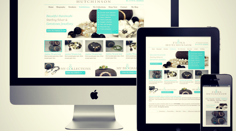
5. Lack of responsive design.
Look around you. Everyone at the coffee shop, in the store, on the sidewalk, and even in their cars is operating a mobile device.
Gone are the days when people spent more of their hours — as much as 16 hours a day — sitting at a laptop. Desktop computers with their separate tower and monitor are even more antiquated.
So it should be intuitive that company blogs and websites as a whole should be designed to be responsive to mobile browsers, right? Unfortunately that does not appear to be the case: Many companies’ sites are still inaccessible, mangled, or partial in mobile view.
Customers who come across your blog on mobile and find that it doesn’t automatically suit their screen will simply not take the time to minimize, maximize, or otherwise bend to your layout. Responsive design is important for all aspects of web content in 2014.
6. Slow loading.
This is absolutely unacceptable to customers. If your images and videos — or worse, your entire content panel — load slowly or partially as a result of a poorly optimized website structure, customers will flee. Guaranteed.
The current generation of web users, which now includes your grandmother and mine, doesn’t have the time or patience of the dialup generation. We will not wait to see your carefully chosen image, and we will not stream your embedded video and wait for it to load the remainder halfway through. A great developer can handle optimization to make everything run faster and more efficiently.


