


Ten gorgeous, creative business cards
Business cards can define your brand instantly. They let customer and business associates know who you are and what you do. But, they also say something about your creativity, or rather they can. A beautifully designed business card tells people you took the time to make an impression, along with distributing your information.
Here are ten of the most beautiful business card designs we’ve seen lately (click any image to visit the designer):
1) Custom designed, hand drawn business cards
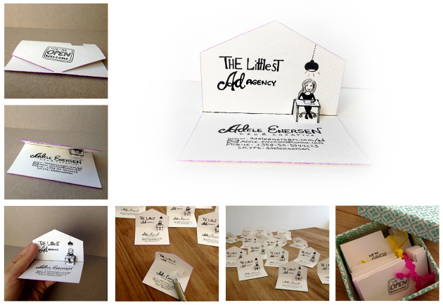
I know, you’re thinking, why? There are so many commercially available, ready-to-go designs on the market, but what if you want something different? Something that is 100% unique and specific to your brand; if you are looking for a design that will set you apart from the competition, you should definitely give these cards a look. These would be especially useful at a conference or networking event, to get your brand name out just by people looking at your card and saying, “hey look at this.”
2) iPhone-esque card designs
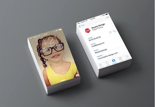
This is another attention-grabbing design, simply because of the size and image quality. Made to be the size of an actual iPhone screen, this business card showcases your images, as well as your information. By using the “slide to unlock” image, you are assured the person will see both sides of your card. This design would be especially useful for artists: allowing you to showcase yourself or your favorite creation, while still including all of your contact information.
3) Classic black and white

These cards look basic at first, but think about it in terms of branding: it has that classic feel, but reinforces your brand image several times over, making it as functional as it is beautifully designed. AGBeat recently brought you a story about colors, revealing that black gives the feeling of luxury. This is something to consider if you are in an industry that wants to project an added feeling of indulgent luxury.
4) Retro colors/templates
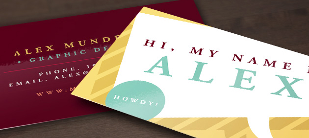
Again, colors are important. There is something fun about the “retro” feel of this design. It really makes your information pop, while still maintaining functionality and readability. The front of the card is a hilarious reminder of how awkward those name tags we all have to wear eventually can feel, but still invites someone to flip the card over and view your contact information. Super fun and stylish, just what you need in a business card.
5) Laser cut acrylic
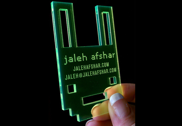
This one is my favorite because it is so different. These are cool not only as business cards, but also, as promotional items. If you handed these out at an event, people would be talking about them. The design, the creativity, and just the general coolness of using laser cut acrylic instead of paper.
6) Fancy typeface and images
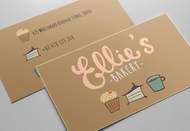
Making the typeface and images the focal point of your design can have a pretty impressive impact. The typeface alludes to the swirly frosting, and the images tell you what they sell without adding extra wording. It is clean, simple, and beautiful. And by using the same images on the back, you are reinforcing your branding.
7) Matching branded products
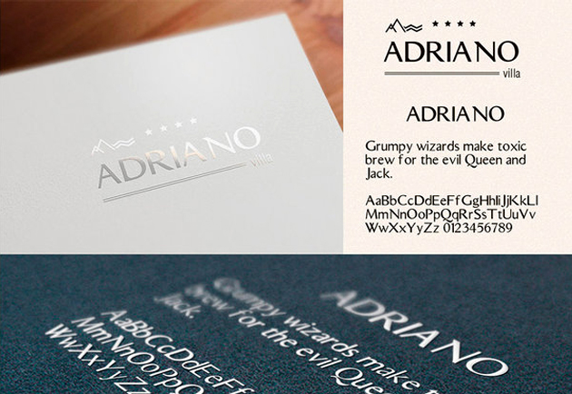
Another example of matching product that maintain a consistent image of your brand. I especially like this elegant design. It is simplistic, but beautiful. The metallic type and rich color of the paper really set off the logo. It looks like you would expect a hotel’s stationary to look.
8) Highlight services
This is a seemingly simple, yet edgy design. This is another way to highlight the services you provide. If you are providing creative services, highlight them on your card with a cutting edge design, witty quote, or anything else to let people know you use your cards to promote yourself and your brand.
9) Bold colors/patterns

A great example of using color to promote brand. The pixilated image cover represents the LGBT icon, only on a much larger scale. Something similar could be done with your company’s own color scheme. It is an eye-catching way to draw someone in to your business design. On the back, it only shows a name, but I think it would carry the color scheme through if each line of contact information used a different color from your scheme.
These are just a few ways you can stand out in a swarm of business card designs. With more and more networking events cropping up, it is important that you have a business card design that truly showcases who you are and what your business is all about.
