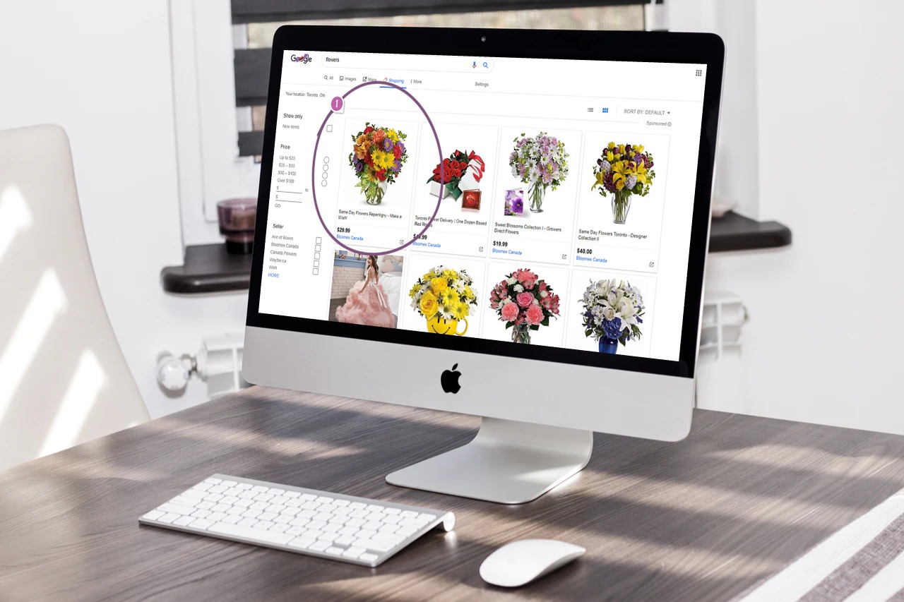
Keen-eyed folks at GoodUI have noticed a slight change in Google shopping results. Google seems to be A/B testing a grid layout instead of a list. Theoretically, a grid would deliver more options in less screen space. It sacrifices a little bit of info along the way. But Google addresses that with an inline expanded view. You click a thumbnail, and Google expands the result, showing you a larger image, along with more product details.
It’s more or less what Google Images already does. You can browse thumbnails, click one for more info, and click through if you want to visit the site that their image came from.
Right now, the grid view isn’t available for every search. Odds are that they’re A/B testing for every result, and then defaulting to whichever one leads to more sales.


Of course, there’s a lesson here for anyone who sells products online. The way that you present information on the Internet can make a huge difference. If a company like Google thinks that it’s worth devoting the time and resources to test this across who knows how many thousands of searches, you probably ought to play with your own store layout a little bit to see what it does to sales.
Google’s constantly making tweaks in an attempt to make their user experience smoother. Their business hinges on a handful of factors, and the biggest one is trust. That means trustworthiness in data security (After all, they literally track you everywhere, through Google Maps, even sending you a monthly summary of where you’ve been.) It also means delivering what you need (and what advertisers want you to see) as efficiently possible.
Of course, not all of those changes are visible. Google is constantly updating the algorithms that serve you information, both globally and for searches with local intent. But if you’re not doing SEO work, odds are that doesn’t affect you as much. (Or if it does, there’s not a lot you can do about it without hiring SEO experts.)
At the time of this writing, you can see the new view for yourself by searching Shopping results for “flowers.” But what’s the takeaway for you?
If your business’ products have a big visual or aesthetic focus, a grid layout may work better.
If your product differentiators are mostly technical details, a list layout can help people make those comparisons a little more easily.
The point is that there are always little things that you can tweak to make your website more efficient – even Google continues to tweak!
Staff Writer, Garrett Steele is your friend. He writes lyrics, critique, and copy for ads, schools, health organizations, and more. He’s also a composer for film and video games, when he’s lucky. (One of his songs is an Xbox achievement!)
















Pingback: Google tests new layouts for shopping results (good to know for your own website) – The American GeniusDave Hendricks Blog | Dave Hendricks Blog
Pingback: Are brick and mortar purchases dead? Thanks COVID-19