
Oprah wasn’t always on Twitter…
A few years back, South By Southwest Interactive Festival attendees began using a little web app called Twitter.com which began simply as an aggregator of everyone’s away messages so people wouldn’t have to visit various sites to quickly review what their friends and contacts were doing. At sxsw it was used to mobilize folks and thousands of people trying to figure out where the hot happy hour was, so much that the old fail whale resulted.
Now, Twitter is a household name- Oprah and my dad tweet, which is a far cry from us sxsw geeks back in the day. For those of you new to Twitter, you may not realize that once upon a time, there wasn’t a standard culture and best practice for Twitter and as early adopters, we helped mold the culture. Recently, Twitter has made a variety of changes to their terms of service and now to the design of their site and those of us who are immersed in the culture are watching closely- some object, some support and honestly, some don’t care, but change has not gone unnoticed.
What interests me most because I have an affinity for web design (although I don’t design anything, I’m more of a fangirl) is the tiny changes Twitter is rolling out that aren’t mentioned on their press releases. So I ask those of you who have been around since BackInTheDay, is change good or bad? Does it matter? Let’s peep some of the changes and then I want you to opine…
Innovate or cling to the old for nostalgia?
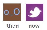 First up, the default avatar has been changed from the standard brown with blue eyes wonky person face to a variety of colors with a bird-ish figure… does this change your wardrobe? Am I the only one with a now-vintage twitter avatar t-shirt?
Besides that, is Twitter getting further away from their logo of the standard bird? Have you noticed there are like three versions of the Twitter bird now generated by Twitter themselves? Does YOUR company have multiple logos?
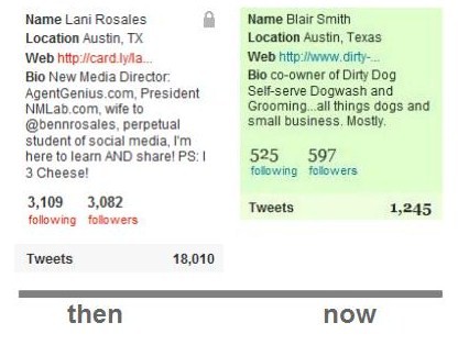
Secondly, look below… Twitter has changed the font to a helvetica, check out the numbers on this picture… Does it matter? Is it cleaner? Is it an indication of a newer UI on the way? Is this like mom trying to chop up carrots and sneak them into the meatloaf so we eat healthy crap?
Lastly, the overall community has designed a variety of “follow me” buttons and although I lean toward the polished icon and the Practika logo set, does it distort the “follow me” message your site is sending when a user doesn’t recognize the logo or are you showing you are creative and innovative? Which of the below do you lean toward?

What are YOUR thoughts? Are these hidden carrots or are they tiny changes that show Twitter is still a diamond in the rough and the polish is on the way?
Lani is the COO and News Director at The American Genius, has co-authored a book, co-founded BASHH, Austin Digital Jobs, Remote Digital Jobs, and is a seasoned business writer and editorialist with a penchant for the irreverent.














Stacey Harmon
September 16, 2009 at 11:49 am
@laniar
Wow Lani – Sharp detail eye you have there! Impressive. Great post.
Twitter never has been a beacon of design, so I’m happy to see some overall improvements to the UI (the home page redesign was certainly a step in the right direction), but I don’t think moving away from their core brand image of the blue bird is a smart move. I’m all for the blue bird evolving, but that change to a purple thing seems a dramatic departure. I think of the McDonalds logo…it always has the yellow M, but the application of the logo has been modernized over time and adapts to the current business environment. Twitter could do the same.
I am perplexed by the change of the font to a serif font. Certainly not more readable. I don’t get it. Makes me wonder if there really is any graphic plan at all.
In general, I belived that good design can make users/customers raving fans of your brand. Now, I love twitter (even w/o great design) but think the entire platform can gain broader acceptance and love with a strategic brand clean-up and redesign. Problem is, as your examples above point out, it doesn’t seem to have any greater standard behind it. At least not that we can see…yet.
Matt Stigliano
September 16, 2009 at 12:03 pm
@LaniAR One of the things I’ve noticed about Twitter in the past is that they throw changes out there willy-nilly and then change them the next day. It’s as if Twitter is in constant beta. I’m all for some change to clean things up and make it look all nice and pretty, but remember when they kept switching what appeared in the left sidebar? Everyday I logged in it was different. It was confusing. Those sorts of changes can be more detrimental to your user stats than anything else. Although there will be those that complain that Twitter “sold out” (to use a music industry favorite) when they change a logo or graphic, I’m not too worried about these as long as it works. For branding purposes though, I have to say it’s a bad move to change too much too fast.
Ian Greenleigh
September 16, 2009 at 1:56 pm
My dad was Apple’s go-to photographer back when few had heard of Steve Jobs or his Macs. He was asking me about twitter the other day, because he’s still not on it. He said, “Isn’t Guy Kawasaki on there?” Uhh, yeah Dad, he’s on there in a big way. “I know that guy. He came from Apple.” Well, Dad, maybe you should get your ass on twitter since you’ve got some inside guys.
See, it’s hard for me to explain to otherwise tech-savvy people like him why they should be on twitter without sounding like I’m trying to literally sell it. When I tell people the things that have happened for me, things that all started on twitter, I understand why they don’t believe me. How can it be of value if it’s free? And fun? Well, you’ll just have to accept it as a new era.
The other day on twitter I made the worst joke ever about a rain dance. Someone on the east coast read it and responded. We had a silly little conversation, nothing of substance. Then he asks me if I have time soon to talk about what I do. He checked out the site. I checked out his, and he’s a huge multifamily developer. From the stupidest little joke, I may get some business and an incredibly reference-able new customer. I wouldn’t believe it myself.
Scott Allen
September 16, 2009 at 3:16 pm
I like the default avatar change from an aesthetic point. On the flip side, seeing the brown wonky face was an easy way to pick out followers who aren’t really committed to Twitter, i.e., many are spam accounts. Of course, among the changes on Twitter are that any serious spammers now use a photo of some cute girl in a bikini or showing cleavage rather than the default avatar, so I don’t know that it matters so much any more.
I do NOT like the new follow button and more generally the shift away from the blue bird. Twitter has encouraged the development of an ecosystem of related products, many of which play on the blue bird as a way of acknowledging the connection to Twitter. Personally, I love the fact that they have allowed, perhaps even tacitly encouraged, this practice, rather than sending out C&D letters for trademark violations.
So what now if the Twitter bird is suddenly a white bird on a purple (or whatever) background? Does the entire Twitter ecosystem shift along with them?
This isn’t just a matter of “If it ain’t broke, don’t fix it.” The Twitter bluebird is a well-recognized, well-established brand that has spawned a plethora of derivatives. Changing it isn’t just risky — it’s downright stupid.
While we’re on the topic of UI changes, I hate the fact that all actions regarding a user are now in a drop menu rather than a simple link. Also, there’s no longer an easy way with Twitter to tell whether someone I’m following is following me back or not (you used to be able to tell by whether there was a DM link next to their name or not).
Atlanta Real Estate
September 16, 2009 at 10:30 pm
“twitter”
The other day I was in the geek section of my local Barnes n Noble. You know, the section with all the 4 inch thick SQL Server books.
These two teen age girls come by, one leading in front of the other, walking pretty quickly through that aisle (I guess so no knowledge would actually stick).
As they round the end of the aisle, the one in the front sees a twitter book (bet that’s a good read, btw) and says “oh cool, twitter.”
With no delay, like it was one long choreographed sentence, the one in the back follows with, “that’s so stupid.”
This is strange because the one in the back was the one texting while walking.
But, regardless, apparently and officially, the verdict is still out on “twitter.”
RM