


Flickr reveals camera stats
Flickr has just released charts revealing the stats of which cameras are most used in the Flickr community and it is not surprising that iPhone images are skyrocketing in volume.
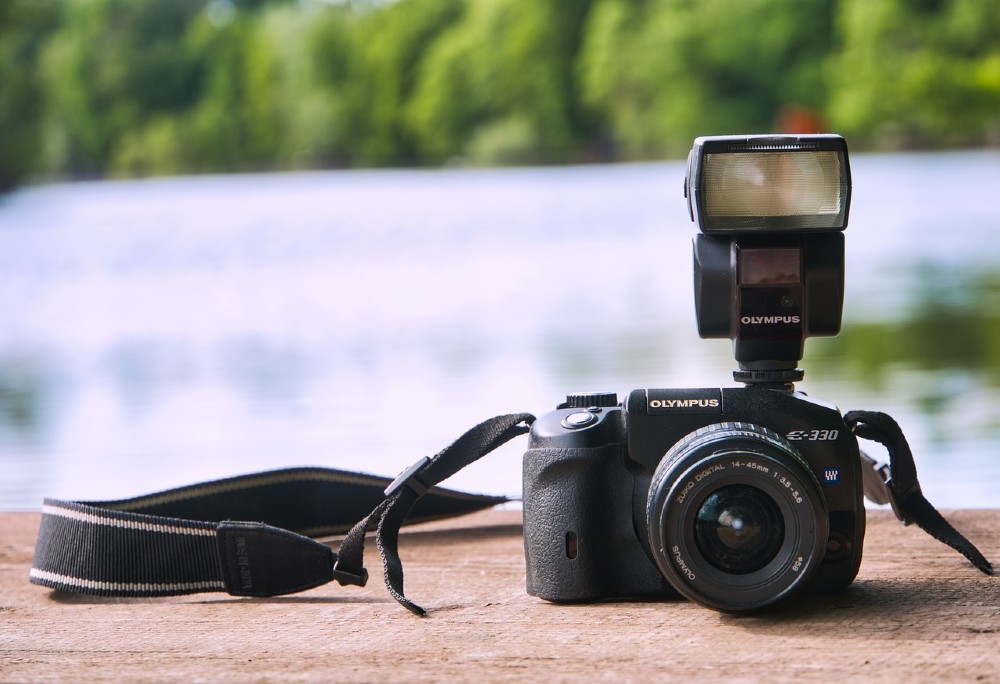
When an image is uploaded, it has data attached to it that tells Flickr (or other photo upload services) what camera was used, like in the image below. According to Flickr, however, not all smartphones register data, so they note the stats on smartphones (not iPhones or Androids) are under representative of the actual number of downloads.

iPhoneitis- the internet has a bad case
Several tech blogs have covered the Flickr stats and we are struck by the number of writers that clearly have what we call iPhoneitis which is an over abundant affinity for any Apple product, and bloggers are claiming that the Flickr stats show a superiority of iPhones as they replace standard point and shoot cameras. Here are the stats and below we will debunk the iPhoneitis.

Several tech writers have seen the blindingly yellow line of the iPhone 4 and although we do too, we are not blinded by its light. It is impressive and unavoidable that the photos uploaded by the iPhone 4 are on the rise, but we see more too it than the superiority of all things Mac, we see what Cisco saw as the shut down production of the Flip Cam line- smartphones in general are becoming more of an all-in-one product for consumers.
The key word above is consumers. Point and shoot camera use is on the decline but we would argue that it could reveal a different stat- the divide between professional photographers and consumers is widening and becoming more apparent. Now, when you see a brand new photo uploaded from a point and shoot, you know the chances of them being a professional photographer is higher than if they uploaded a shot with an old iPhone.
According to Flickr, “these graphs show the number of Flickr members who have uploaded at least one photo or video with a particular camera on a given day over the last year. The graphs are “normalized”, which is a fancy way of saying that they automatically correct for the fact that more people join Flickr each day: the graph moving up or down indicates a change in the camera’s popularity relative to all other cameras used by Flickr members. The graphs are only accurate to the extent that we can automatically detect the camera used to take the photo or shoot the video (about 2/3rds of the time). That is not usually possible with cameraphones, therefore they are under-represented.”


Benn Rosales
April 18, 2011 at 12:11 am
It also demonstrates a decline in sharing amongst professionals who aren't sharing via flickr. Flickr's power user is now the amateur and I'm not sure it bodes well for Flickr. Iphone issues aside, I hope flickr can see past the pretty yellow line too.